This is the rough layout of my magazine front cover. Due to my lack of artistic abilities I have only drawn rough plans which I will now go on to annotate, starting with the masthead of my magazine. As you can see, I have chosen the name of my magazine to be "Nu-Folk...", I chose this because it is very simple and straight to the point, it has the name and genre of the magazine within the one word. I also decided to use and ellipsis to encourage the reader into wanting more from the title. The masthead will be will be a bold, capital lettered, black font, this will be nice and simple for the audience to read and recognise, it also links to the simplicity of folk music as it is often referred to as "going back to basics".
I have chosen to utilise a "puff" in the top right-hand corner of my magazine to highlight that this is the first magazine to be published for the company. I intend to use, again, black capital letters which will stand out and draw the reader in. I think I will use a background colour for the "puff" but it will be a neutral one to stick with the "rootsy" kind of feel that i want the magazine to have.
I have used a "+" sign to indicate more content in the magazine because it is recognised to mean "more" or that there is something more to be "added". I will colour the "+" the same as the "puff" on my magazine to create a house style and to compliment the cover of the magazine. I will show the names of the other people featured in the magazine in a black, capital lettered form so that they stand out and entice the reader to look.
To announce the main focus of the front cover of the magazine I will use bold, capital letters to show the name of the person on the front. I think I will use a different colour to black on the text though because it could take away from the masthead if I use the same colour.
The bottom of my magazine will have a strip which will advertise the special features of the magazine and attract the reader because of the exclusive content. Once more I have used the "+" sign to stick to the idea of a house theme, I will also use the capital lettered feature again to stick with the importance of the magazine.
This is a very, very rough idea of what the image on the front cover will be however, again, due to my inability to create artistically correct drawings I had to draw it separately so as not to spoil the main front cover.
This is my contents page, I chose not to name it "contents page" because "Inside this week..." sounds far more interesting and welcoming, again, I chose to use black, bold capital letters which will run with the house theme because it is nice and clear and most people can read it. I will also have a black line that will run from page side to page side to make the page more aesthetically pleasing.
As you can see I have split my contents page into three columns with two columns for "regulars" and "features" both of which will be underlined to stand out, however, the text wont be in capital letters because it doesn't need to stand out a great amount. The lists of items underneath these heading will again utilise the "+" sign to stick with the house theme, the page numbers will be featured on the opposite side to the "+" to balance out the page.
The main focus of the contents page will be in the middle of the page and will have a picture to attract the reader to it more, it will have a layout a little bit like a polaroid picture, again, creating this back-to-basics feel and allowing emphasis upon the mini-headline and page number. Three more pictures will be underneath the main layout of the contents page, one in each column. They will have the same aesthetics of the main picture on the page.
There will also be an advert for a magazine subscription underneath which I will design, it will be pretty basic and just get the job done.
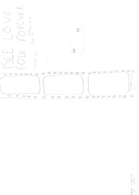
For my double page spread I have split the pages into two and used the left hand side for one main, feature picture, this will appeal to the audience because often people like to use the full page pictures as posters and such like. There will be a small caption in the corner of the page which will be a witty kind of comment.
I will also feature a film strip down one third of the right hand page which will allow me to add three more pictures to the page whilst still looking aesthetically pleasing, the background of it will be black which will make the pictures look better and make them stand out.
The title of the article will utilise two-thirds of the right hand page, the font will be bold and black in capital letters to enhance is and make it stand out. I will be writing “Isle love folk forever” as a play on words to entertain the audience. I will have a small summary underneath the main title of the page to inform the reader about what is going on. The main elements in this summary will be written in bold to, once again, stand out and attract the audience
Location shots
DPS
This is the location shot for my DPS it was taken in a field close to where I live, i tried to pick somewhere that would have none, or little buildings in the background to create an atmosphere like the one described in my article.


No comments:
Post a Comment