


The magazine cover is dominated by
the title of the magazine. By using a white font the title is extremely bold
and the capital letters emphasise this. By being a simple and plain title this
reflects on the magazine, it connotes that it gives the reader what they need
without being cluttered by unneeded information and content. The Fly is quite a
small magazine which is not known to be amongst the mainstream category of the
music magazine industry. An element which enforces this point is that the title
is layered on top of the main image of the magazine, it tells us that the name
is still growing and the magazine is not yet known widely enough to use the
image layered to cover the title. The title also includes a sub-line which
shows the URL of the magazine’s website, this shows the reader that there is
more than just the magazine and online there can be more content. The use of the website also shows that the
magazine is based in the UK, this aspect appeals to the British audience, often
a national audience are swayed towards picking up their own magazines.
The
magazine also has a buzz word associated with the title, “Free”, this is also
aesthetically pleasing to the audience in the way that it uses the style of a
yellow price tag sticker, which most people have come into contact with in
their life. The “price tag” also has the date of the magazine on it, this shows
that the magazine is a monthly magazine and therefore shows the reader that
there will be a lot of content in there, which opposes the general look of the
magazine.
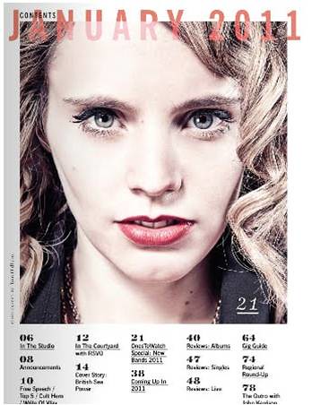
The
background of the magazine is an artist who we can assume is the main feature
in the magazine. She has minimal make-up on and is addressing the reader
directly, by using this close-up shot of the artist it creates a connection
with the reader and draws them in. The
artist has quite a blank expression on her face but her mouth is poised as if
she is about to speak, this ties in with the sub-line which says “The first
lady of folk speaks”. This again, reinforces the fact that she is addressing
the reader directly. When considering the lighting used, it is very light which
gives the artist a pale complexion; this compliments the title of the magazine
with the pale, neutral colours. However, this juxtaposes the bold, black colour
of the name of the artist.
The
cover lines on the magazine are positioned at the sides of the magazine, the
frame the artists face and, in a way surround her, which could connote the
layout of the magazine, indicating that the cover story will be in the centre
of the magazine. The cover lines use a serif font which gives them more
presence on the page, also, the use of the colouring links with the title and
emphasises the link shared between them.
There are only four extra cover lines on the cover of the magazine, this
again links to the idea of not overpowering the reader with information, only
the names of the artists are used on the cover of the magazine, this leaves the
audience wanting more information and beckons them to pick up the magazine.
Another
key feature of the magazine is the main cover line. The text is a serif font
and simply highlights the name of the artist. The black colour contrasts the
white that is used in all of the other fonts however, white is used to back
shadow the text which emphasises the colour scheme once more which is, for the
most part, black and white. All of this in context again shows that the
magazine is simple and straight to the point simply doing its job and doing it
well. There is one small feature which
adds a small amount of complexity to the magazine in the form of a small
element which, I believe, is used to balance the layout of the wording, if it
was not used it could be said that it was too heavy on the side of the letter
“G”.
This is a click through link to the analysis of the contents page:
This is a click through link to the analysis of the contents page:
This is a click through link to the analysis of the contents page:
 |
No comments:
Post a Comment